25.10.2024

Featured in the Telegraph: How to create a boot room in your hallway
Clever ways to store muddy shoes - whatever the size of your hallway
We were featured today in the Telegraph of one of our recent projects: A House with Pink Stairs.
Great to be featured alongside some big names such as Ben Pentreath, Johnstone Parke Interiors and Studio Duggan.
For the full article click here.
Most townies are not able to designate an entire room to mud, so co-habitation is the
answer. For Seán McAlister of Pencil and Brick, a London-based architecture
practice, the solution is a “boot wall” in the hallway, for which you’ll need a
minimum of 300mm of depth. With Pencil and Brick’s projects involving plenty of
Victorian terraces, that has sometimes meant knocking into the adjacent living room
to “steal” space. And to optimise what space you have, the boot wall requires
bespoke joinery fitted tight to the walls: “In a city home, you have to eke out every
opportunity,” he says.
Because this is a small area, compared to its country-house counterpart, McAlister
says the boot room needs to be “curated”. “You’ll see it every day, it has a
disproportionate visual impact, so choose what the family buys carefully – don’t
overcrowd it.” (He also insists on open storage, because wet stuff in closed cupboards
will shorten their lifespan.) It’s crucial to conduct an audit, he says, “of your needs
now and in 10 years’ time. This option is expensive [he estimates about £6,000 plus
VAT] – you’ll want it to last.” McAlister also advises avoiding rich, heavy paint
colours, “so they don’t compete with the rest of the hallway”. He adds: “You could get
something in IKEA, but you’ll lose the beauty of handmade craftsmanship.”
Credits:
Interior Design: Anna Hewitson Design
Photography: 82mm
17.06.2024
Hitting New Heights feat. Home Building & Renovating
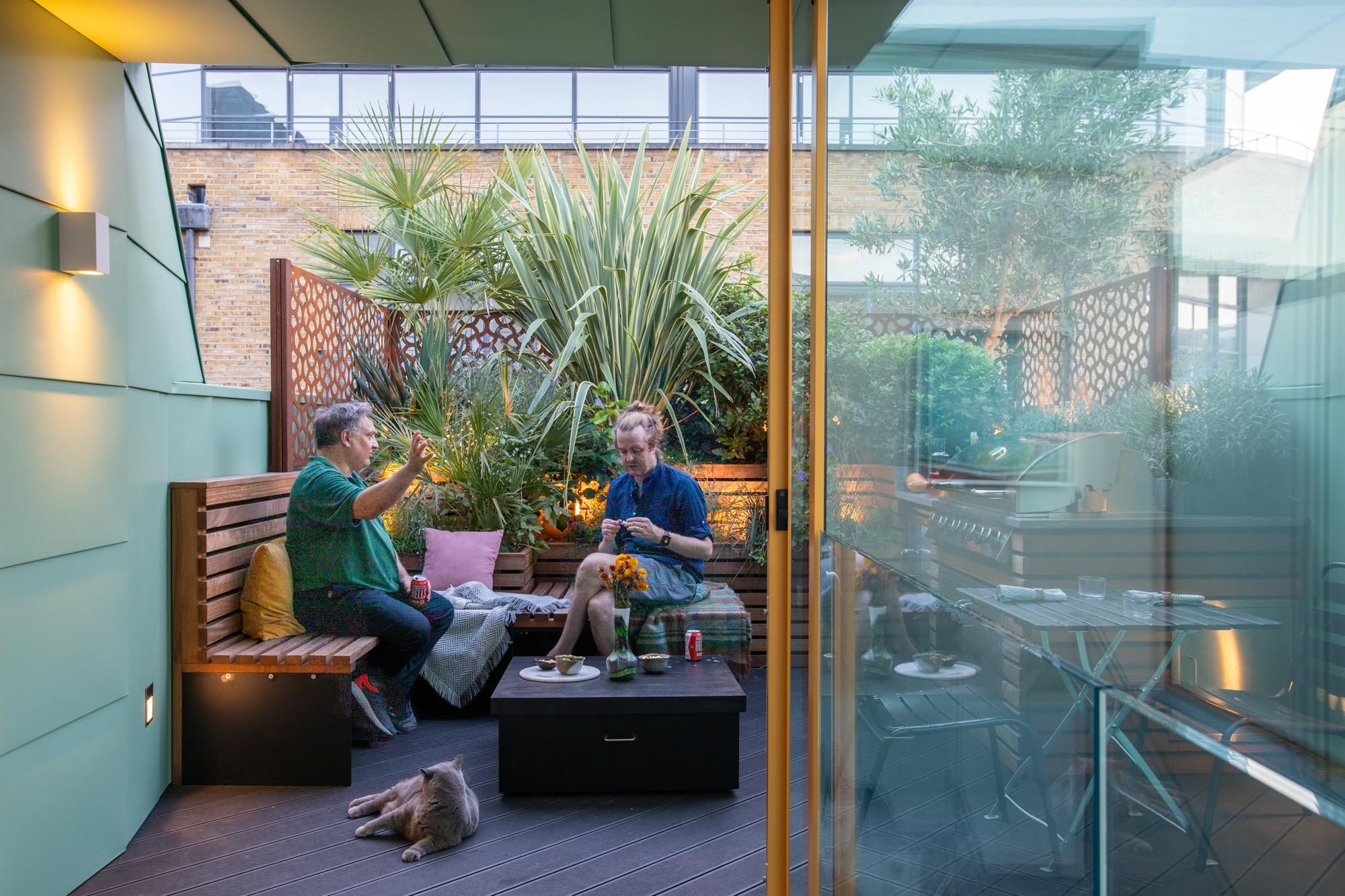
June issue: Featuring our client at A Penthouse for Two Cats where "the luxury of achieving an outdoor space in his London home seemed like a fantasy, but a rooftop penthouse suite made it a reality."
See the full article here.
14.06.2024
Ridding of the Rogues
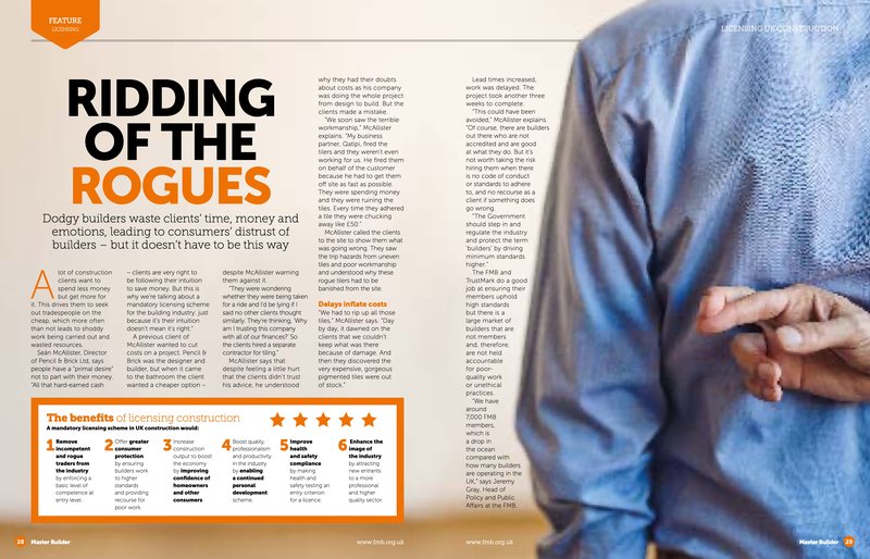
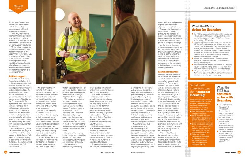
Dodgy builders waste clients' time, money and emotions, leading to consumers' distrust of builders - but it doesn't have a to be this way
Click here to see the full interview with our Director Sean McAlister in the Federation of Master Builders Magazine back in January - discussing the challenges consumers have today, with rogue builders.
02.02.2024
A London architect bringing contemporary flair to traditional buildings
Good design: contemporary with an eye to the past
"We’re known for our aesthetic balancing acts between the Victorian niches of London’s homes, and playful contemporary flairs. We often refer to London’s 1800s Sir John Soane’s architecture, and his use of Lumiere Mysterious. We care about playfulness, thoughtfulness. Designing with darkness and simpleness in mind, not just always seeking maximum light or defaulting to open plans." Sean Mcalister - Director
Check out the whole article below
Read more22.01.2024
Featured on Houzz: 5 Most Popular Bathrooms on Houzz right now!
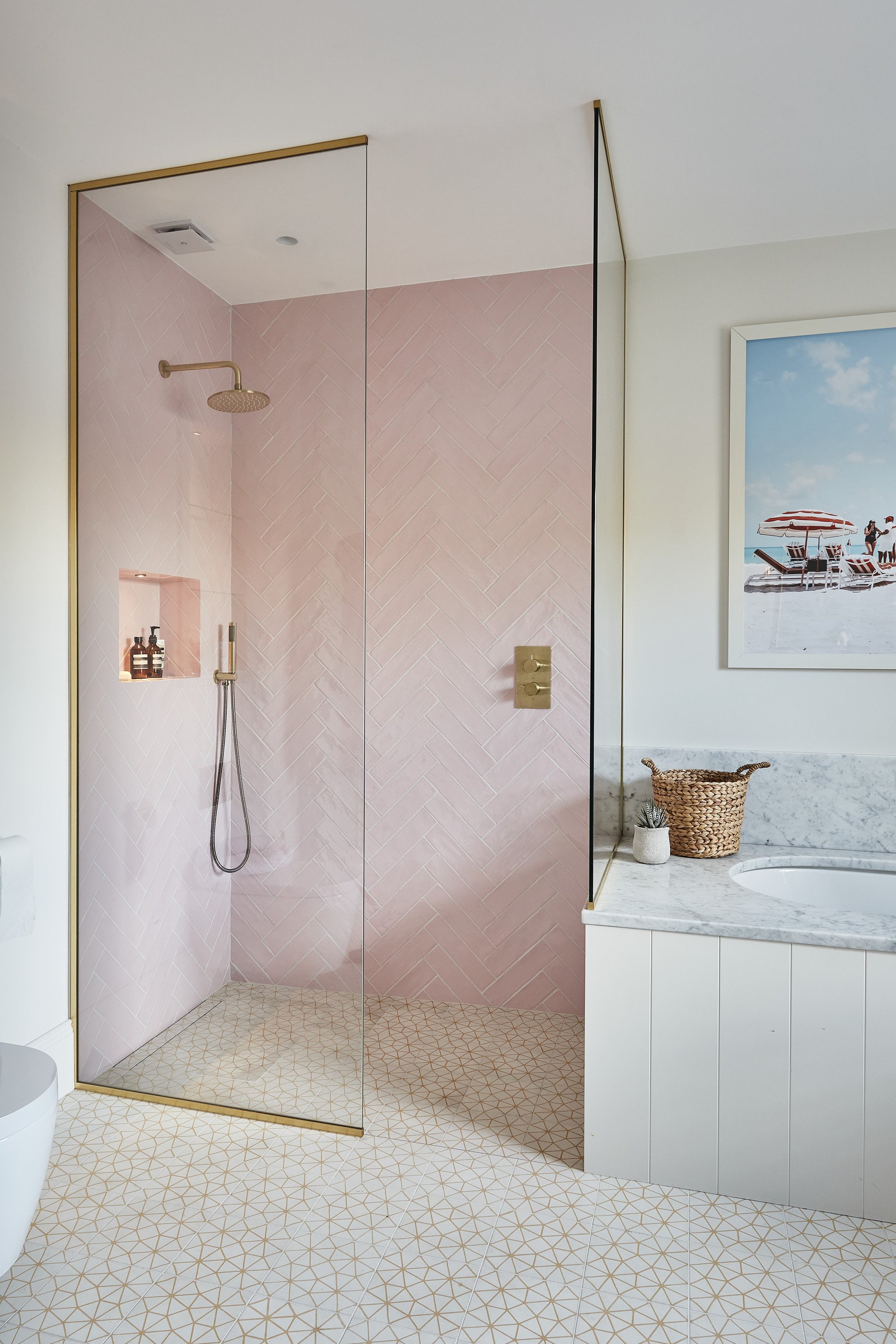
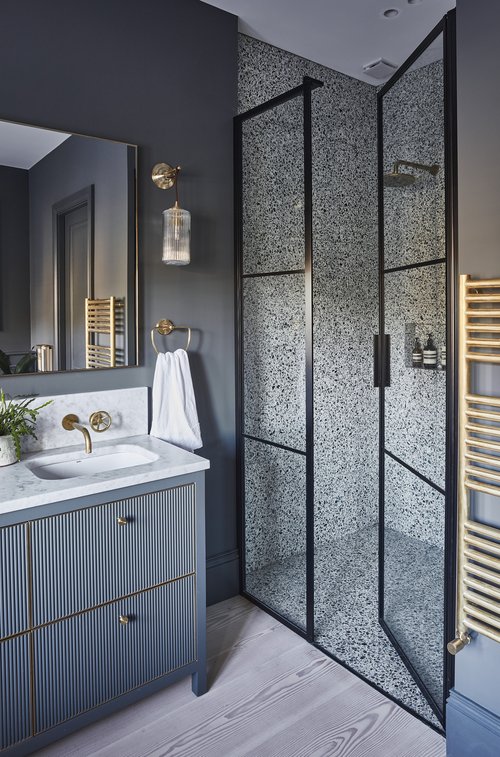
Hot of the press: two of our recent bathrooms have been selected by Houzz as the “most saved” on the website.
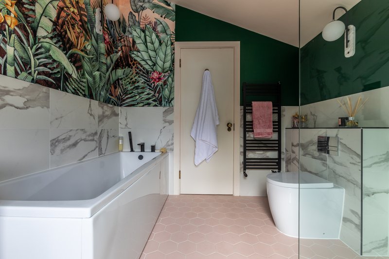
The first, “this mostly neutral bathroom is taken up a notch by the addition of glossy pale pink tiles in the walk-in shower.
The warm colour is inviting and enveloping, while the herringbone pattern and uneven texture of the tiles adds interest and a modern edge. Brass details in the glazing frame and tapware add to the feeling of warmth.”
The second evokes hotel chic with “it’s elegant details that give this en suite bathroom its spa-like mood. The sophisticated palette of black, white and grey-blues is given a touch of glamour by the brass fittings in a rich brushed-gold finish, not least the gleaming towel radiator.”
Look up the project on our website:
Check out the whole article:
Featured on Houzz: 5 Most Popular Bathrooms on Houzz right now!
19.01.2024
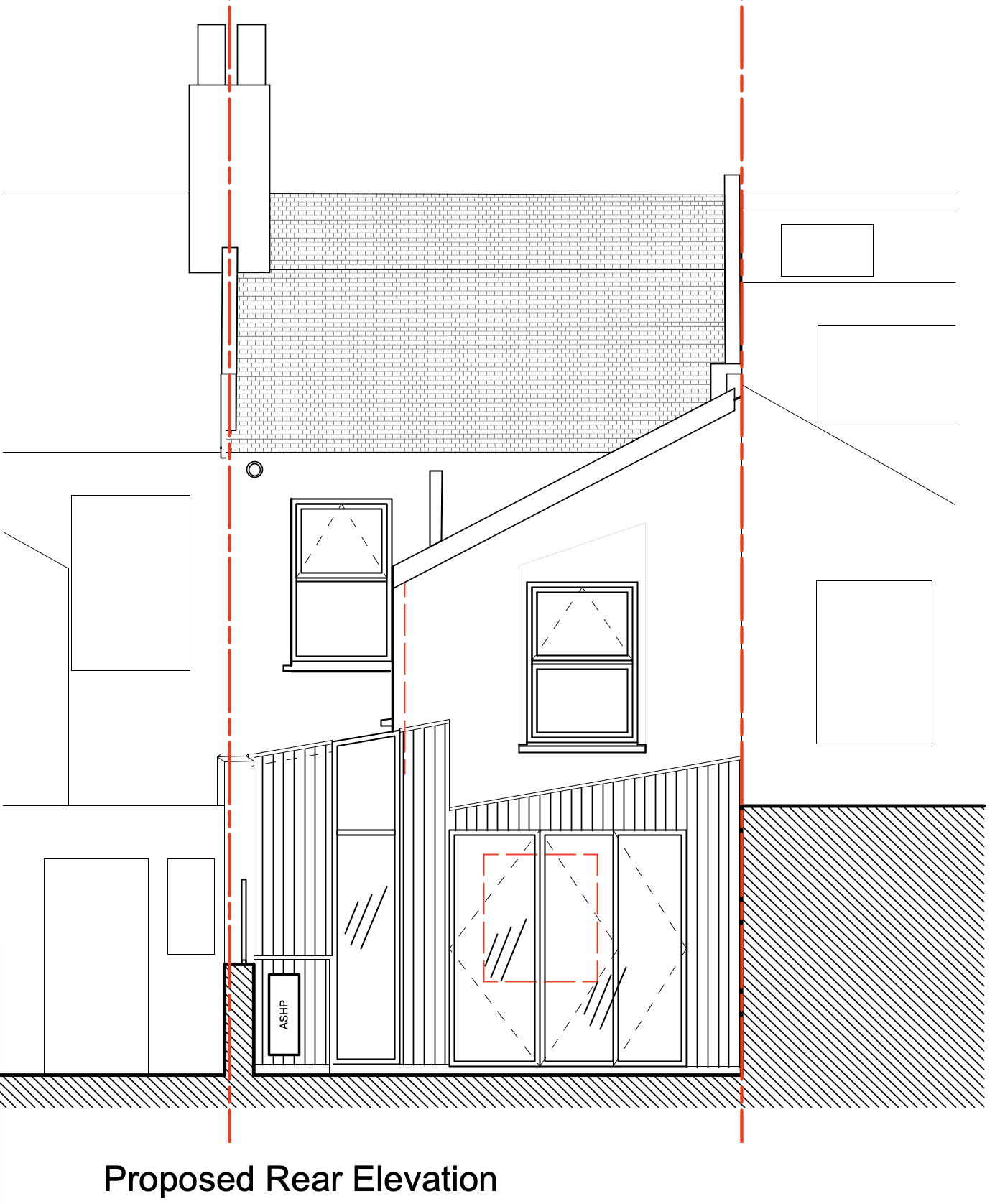
Planning Permission for a Side Infill, Rear Extension and Retrofit project in Wanstead
A side infill, rear extension and retrofit project in Wanstead also recently received planning permission.
This project will see the reconstruction of an existing side extension, as well as the creation of a new rear extension with an internal courtyard offering more light and air into the centre of the plan.
Excitingly, we have been granted permission for Front Wall insulation as part of the project, a first for the project team, which sets a great precedent for what we are able to achieve.
As part of the retrofit our application includes an air source heat pump, which helps build precedent for a greener future in construction. We are seeing more clients choosing this kind of heating system, which is great to see.
15.01.2024
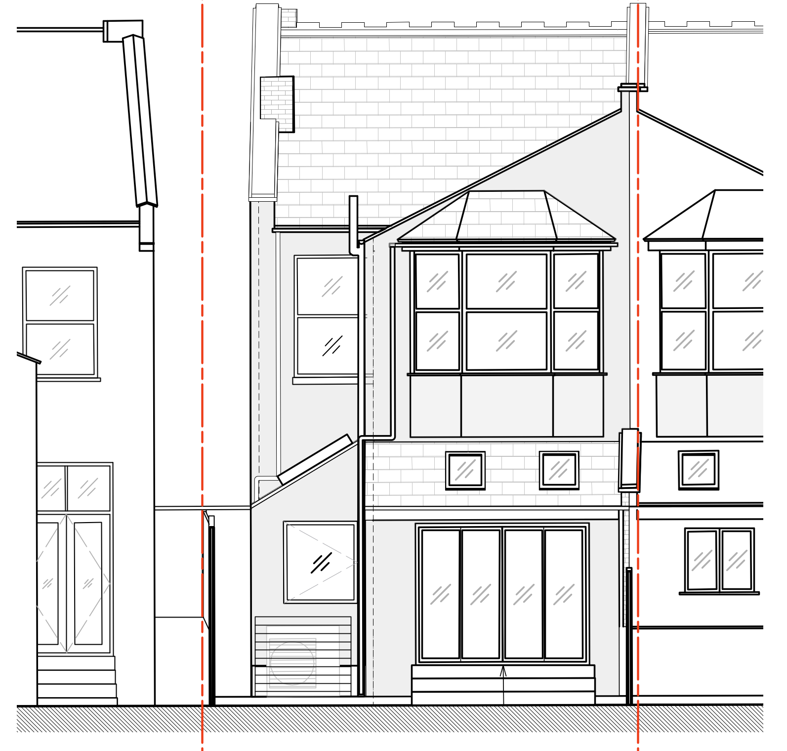
Planning Permission for a Rear Extension and Retrofit project in Waltham Forest
A rear extension in Waltham forest recently received planning permission.
This project will see the reformation of an existing side extension, with a thorough retrofit and upgrade of the existing thermal envelope. Not an easy site to work with, however, the team did a great job navigating the gradient on site to make the extension work.
As part of the retrofit our application includes an air source heat pump, which helps build precedent for a greener future in construction. We are seeing more clients choosing this kind of heating system, which is great to see.
13.12.2023
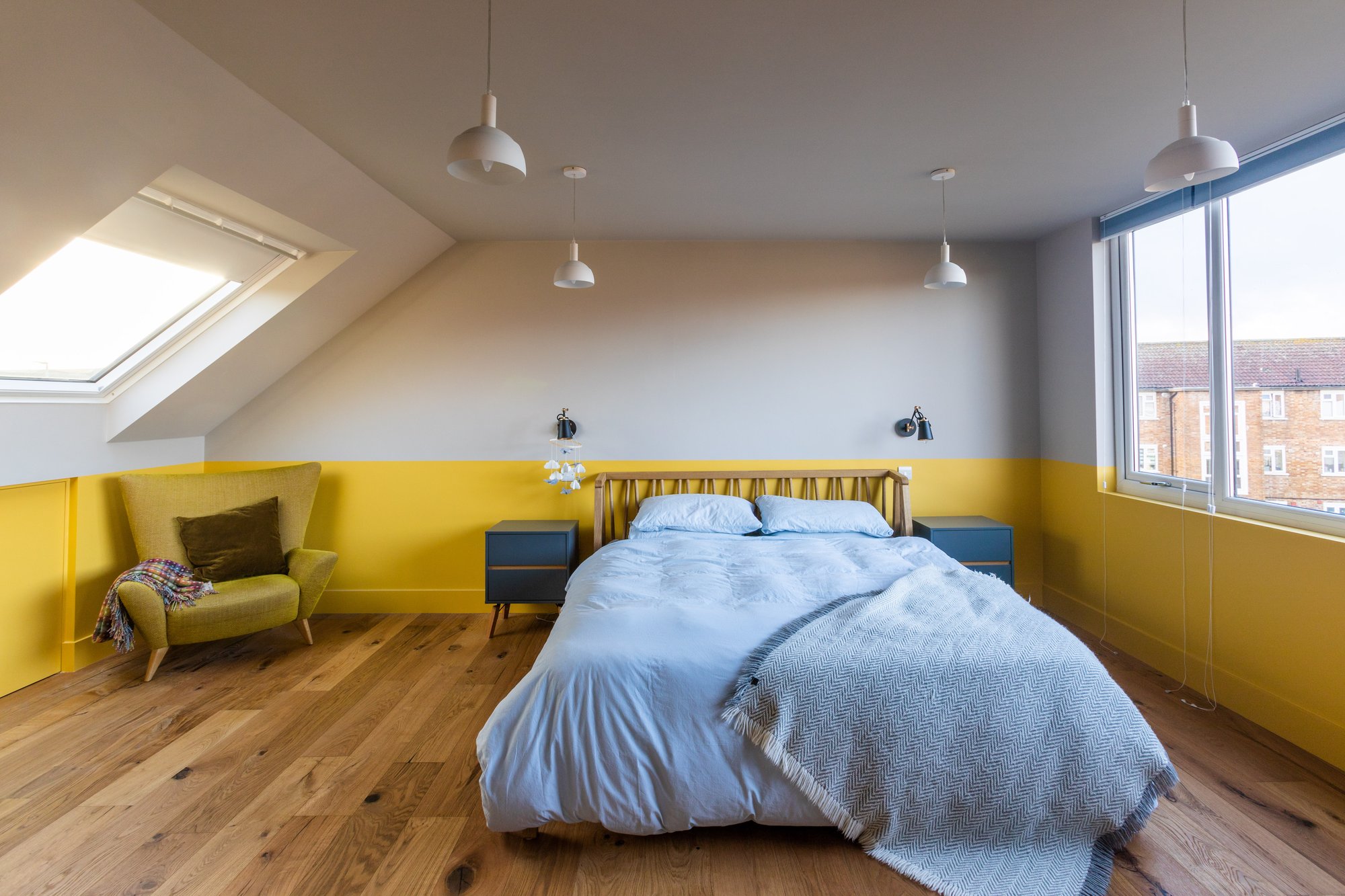
Planning a Loft Conversion
Discover the factors that determine whether or not a loft conversion can be completed without Planning Permission
It’s a common home improvement that’s often covered by Permitted Development Rights, but there are occasions when a loft conversion will need Planning Permission, so it’s important to understand the rules.
Houzz asked the experts what you should know, so your work passes muster with the planning officer.
Professional advice from: our Director Seán McAlister amongst others.
Look up the project on our website:
Check out the whole article:
03.11.2023
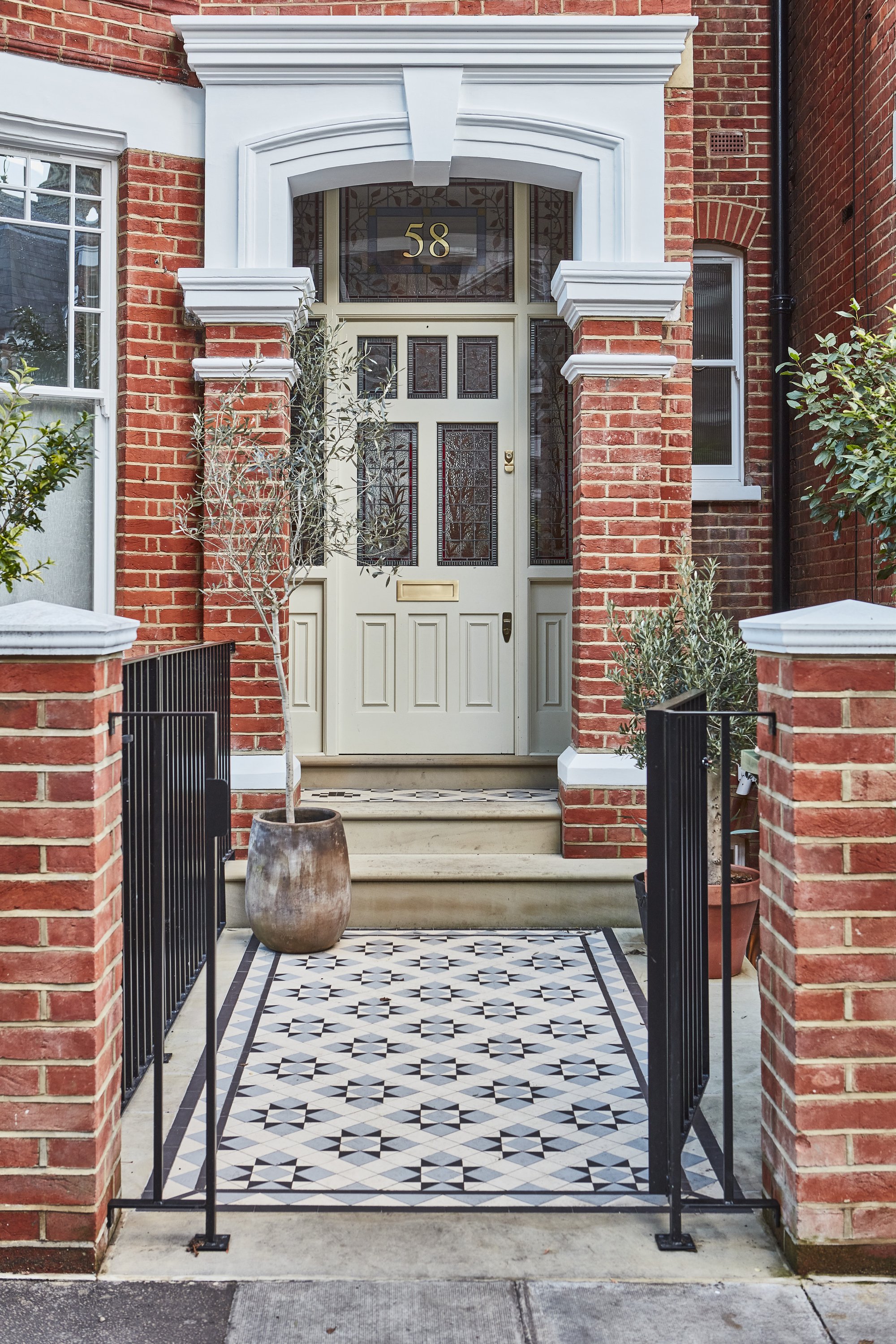
A Period Family Home is Gently Brought Back to Life
Another feature of our project A House with Pink Stairs on Houzz, this time looking at how we restored and revitalised this previously dishevelled home
When we first saw this tall London terrace, it was in a state of dereliction. “It was already in the process of being gutted and was damp and rotten – but a real diamond in the rough,” our Director says. “It has good bones.” The team reconfigured the internal layout and added a basement and a loft to the building, as well as a statement pink external staircase.
The owners wanted a sociable family home that also had “pockets of privacy” and an understated feeling of luxury, but was “bold and cool, with splashes of fun”. “They liked the idea that it would feel like a five-star hotel, beautiful and comfortable”.
Look up the project on our website:
Check out the whole article:
Houzz Tour: A Period Family Home is Gently Brought Back to Life
29.09.2023
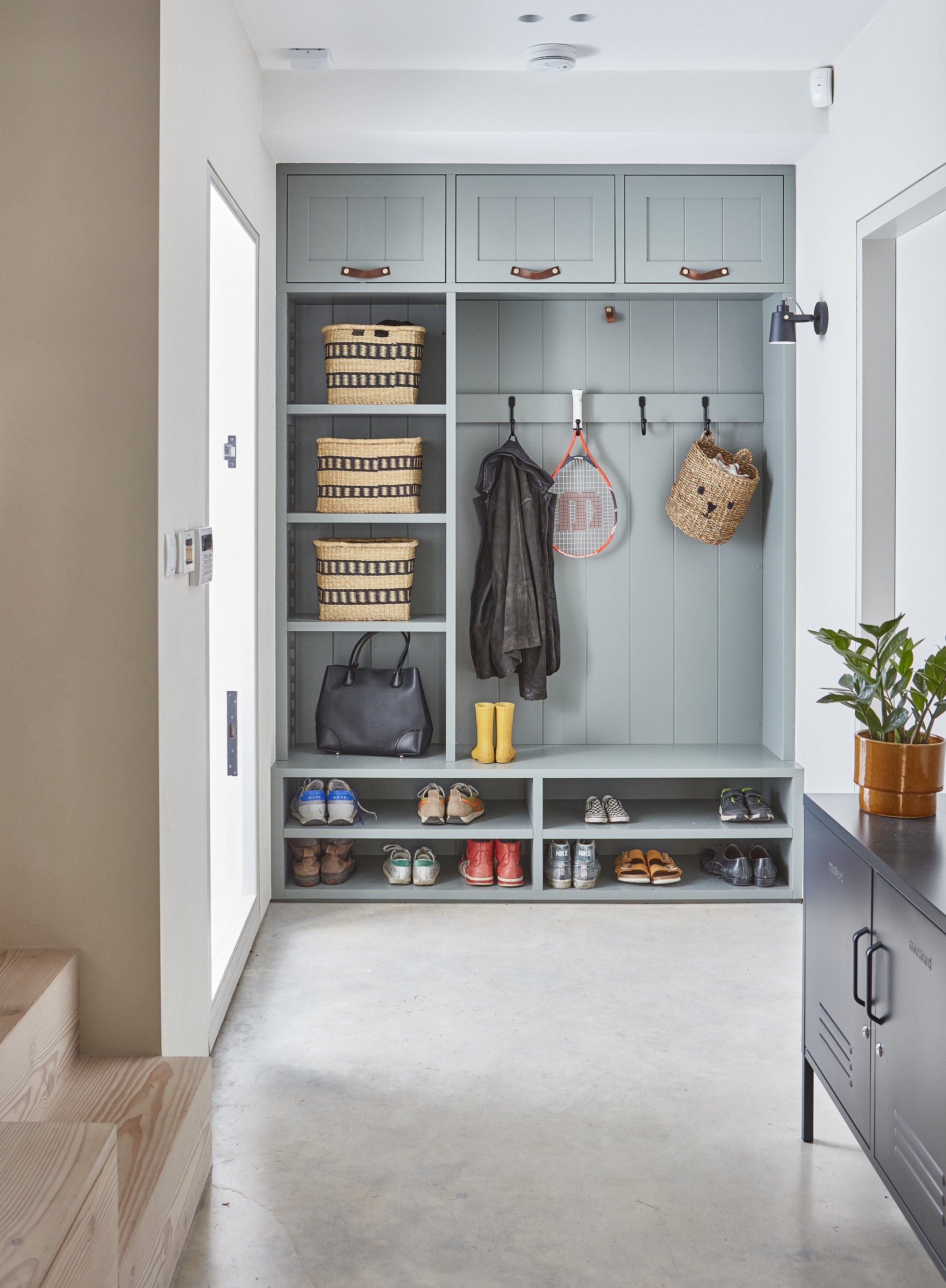
How to maximise storage in your hallway according to Houzz
Our project A House with Pink Stairs has been featured again on Houzz
"As a transition space from outdoors to indoors, hallways have to work hard to make sense of the jumble of coats, post, umbrellas and bags that naturally accumulate in this space every day.
If your hallway is on the skinny side, take a look at this clever little storage unit, designed and made by Pencil and Brick, for inspiration. To make up for the lack of shelf depth, every inch of vertical space has been harnessed instead to make space for hallway essentials."
Look up the project on our website:
Check out the whole article:
25.08.2023
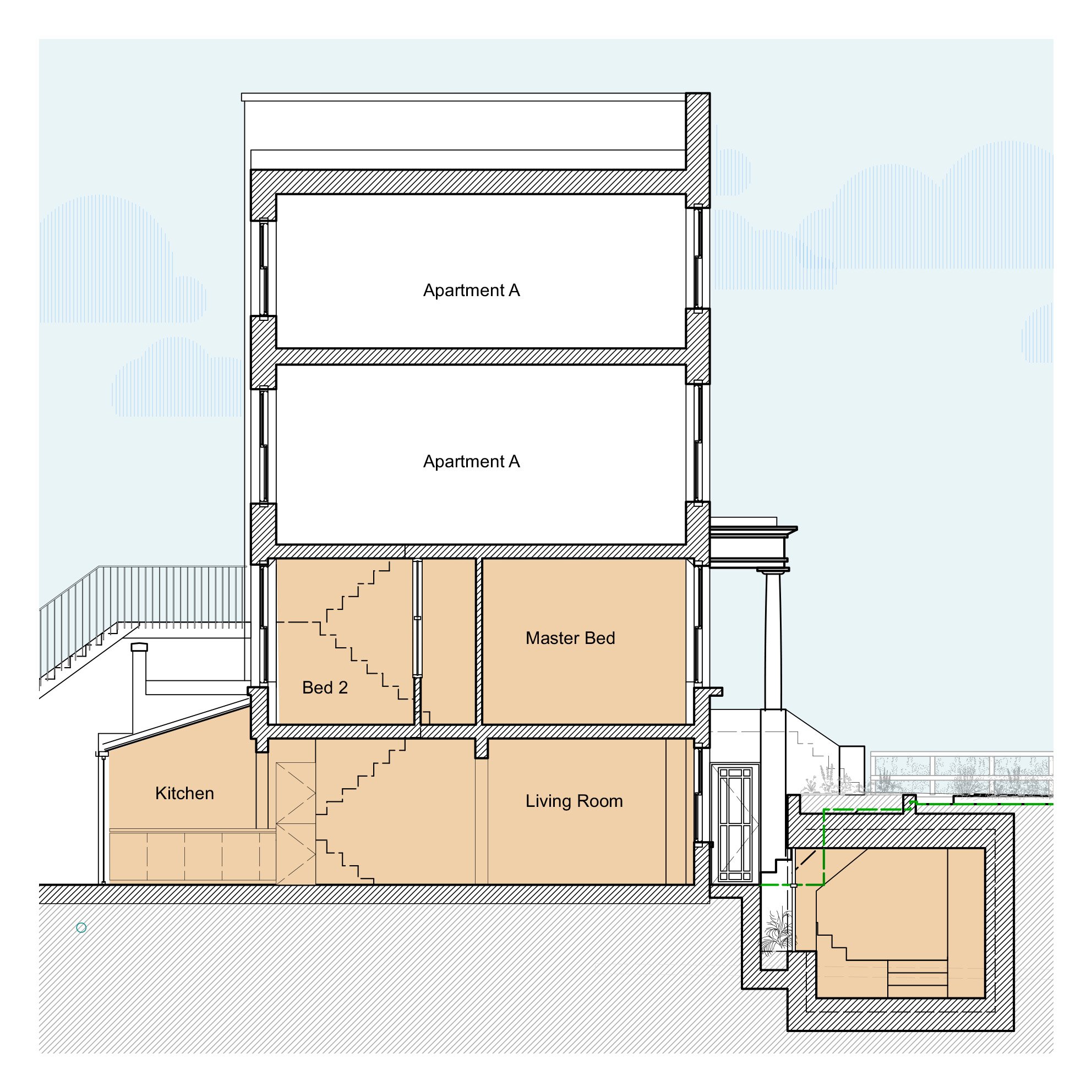
A Hidden Garden Room in Islington got Planning Permission
A day room in Islington just got planning permission
This project that Pencil and Brick helped design proposes a new day room for this family in Islington. To be able to stay in their beloved flat this family chose to extend their home to the front with a hidden day room under the garden. The extension adds space while maintaining the front garden. Pencil and Brick contributed to this design and is excited to see the project has now gotten planning permission.
02.06.2023

A Bar for Two Horses is shortlisted for the BIID
Our project A Bar for Two Horses got shortlisted for the British Institute of Interior Design Awards
We are excited to announce that our project A Bar for Two Horses has been shortlisted for the BIID Awards for best interior design. The project takes cues from the industrial history of the area and gives it a mid-century feel. The restaurant is split over two levels with a mezzanine level overlooking the large bar in a terrazzo style.
Read more about the project here:
See the full shortlist here:
Interior: @flamingo_oak
Photo: @82mmphotography
21.04.2023

Amazing Awards
Pencil and Brick wins two Federation of Master Builder Awards
We are excited to announce that Pencil and Brick has won two of the prestigious Federation of Master Builders Awards at Friday night's ceremony in London. Our project A House with a Courtyard won the prize for best Large Renovation Project and best Bathroom Project. The award recognises projects across 11 categories and across the wider London area.
Our project has received high praises from the judges for "Its quality of finish, along with the team's project management ability" and our clients welcomed the "professionalism and attention to detail" we could provide for them.
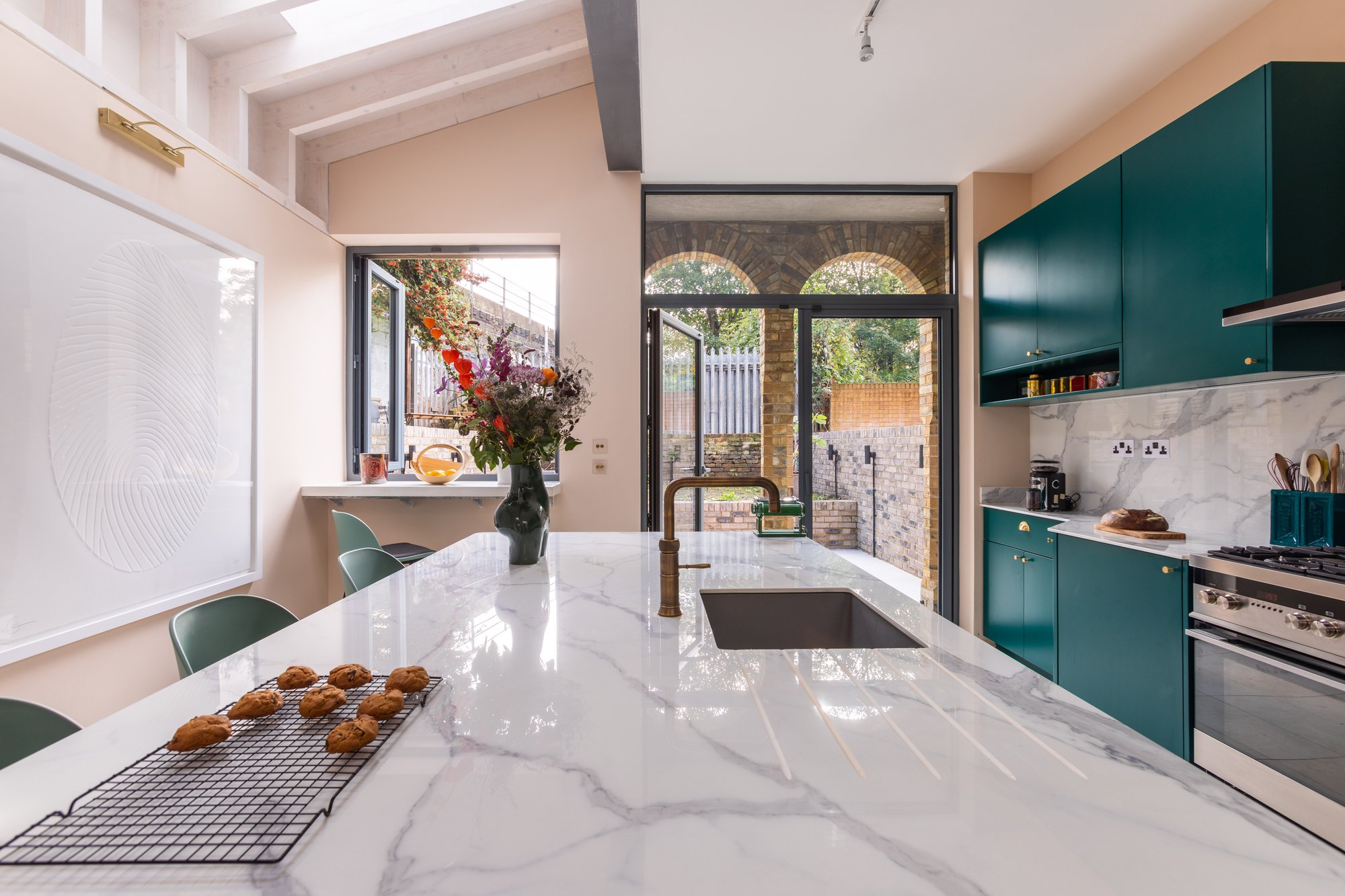
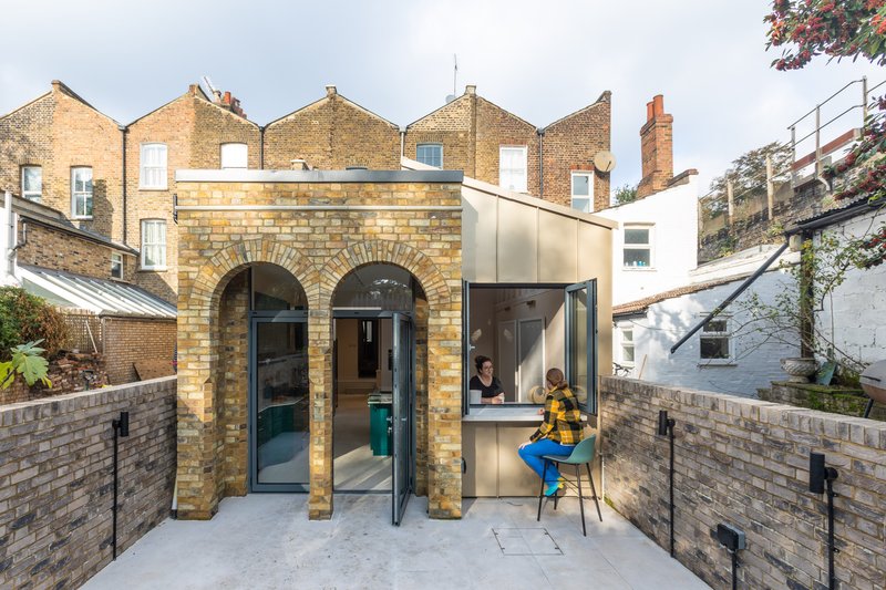
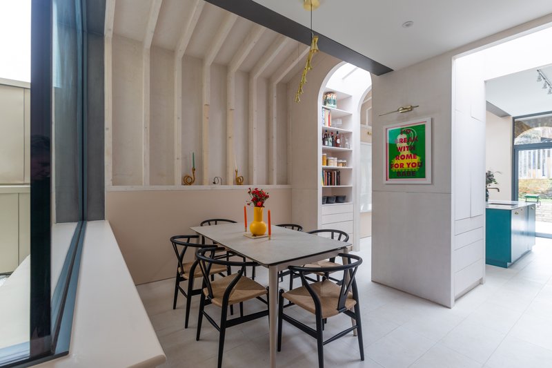
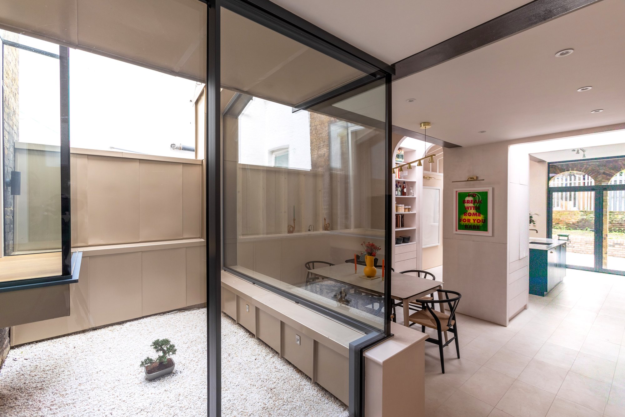
The project is an extension to an existing Victorian terrace house in Southwark and features and internal courtyard and a bespoke joinery element creating a threshold between the kitchen and the dining area. A portico with two brick arches is a reference to the Victorian character of the house but gives it a modern twist.
Check out the full project here:
Read the Award Committee's comments on A House with a Courtyard on the FMB's website
We would like to thank everyone who was involved in the project and made it possible.
Special thanks to:
Constant, Structural Engineers Constant Structural Design
Goldfinch, Joinery and Kitchen Goldfinch Furniture
KM Dimensions, Quantity Surveyor KM Dimensions
The Steel Team, Steel Suppliers The Steel Team
Georgian Roofing, Roof Specialists Georgian Roofing
Dragos Vlad, Steel Roof Specialist
Bert & May, Tiles Supplier Bert & May
Martina Oh Photography, Photographer Martina Oh Photography
Travis Perkins, Brick Suppliers Travis Perkins
Windsor Reclamation, Brick Suppliers Windsor Reclamation
London Reclaimed Brick Merchants, Brick Suppliers London Reclaimed Brick Merchants
Umar Ahmed, Plumbing Integration
Southern Windows, Glazing Suppliers Southern Windows
Assent Building Control, Approved Officers Assent Building Control
Graham Hamblin, Party Wall Surveyor Hamblin Sullivan Associates


 Read more
01.05.2023
We were featured on Houzz
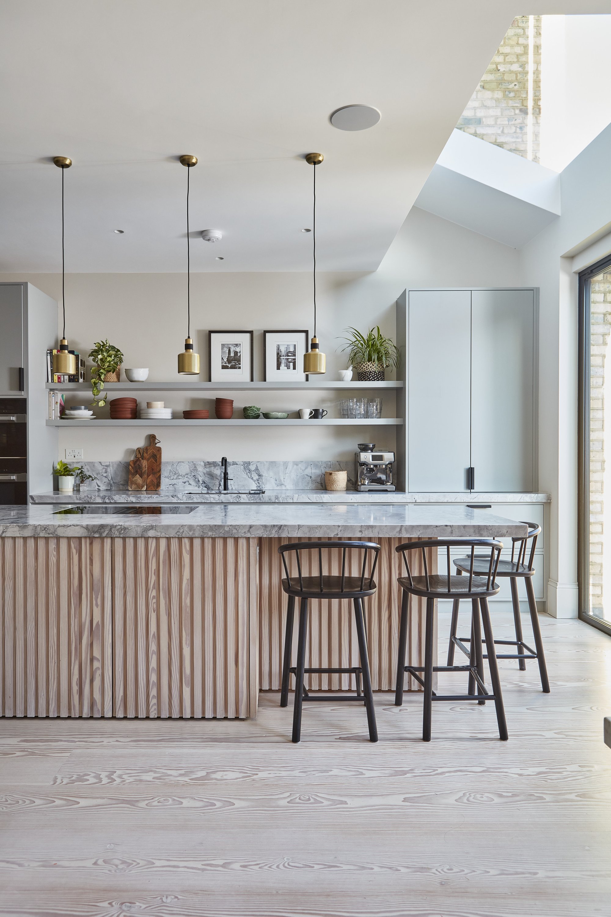
Our project A House with Pink Stairs has been featured on Houzz
Our clever and playful storage solution for a family of five was featured on Houzz. The combination of open and closed storage allows for a lot of space to this basement extension.
Look up the project on our website:
Check out the whole article:
14.10.2022

Sean elected to FMB London Board
We're proud to announce that Sean has been elected to the Federation of Master Builder's London Board. See some of his mission statement in this FMB interview article.
Read more14.04.2022
We've been featured in Houzz
Exciting news about our project A House with a Courtyard. Our project for a Victorian terraced house with a rear extension for an art-loving couple has been featured in an article on Houzz.
Read more24.01.2022
Practice Manager
Sean and Stephen is looking for a skilled practice manager to join its ambitious and progressive team in East London. We are interested in the question: what is a 21st Century architectural practice? We’re about to start a new adventurous chapter for the business, bringing with it a refined vision for future growth.
Read more16.07.2020
Coffee Break
Taking part in the quality control with Perky Blenders coffee roasters. We are getting to know the processes involved in running a coffee shop. This will form the body of our new project in Finchley.
I'm told we will be quality controlling the pastries next....

28.01.2020
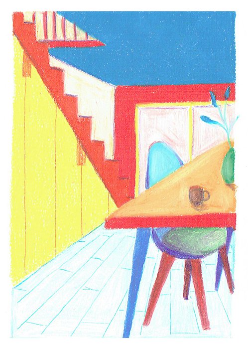
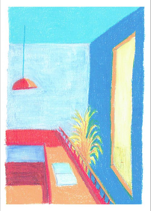
A House for Two Artists
Hand-drawn visuals for a house of two artists. A refurbishment proposal to introduce a more open living and allow the free flow of movement on the ground floor.
06.06.2017
Podcast Interview with Business of Architecture
Podcast interview by Rion Willard with Seán, on the subjects of business and architecture.
Published on businessofarchitecture.com and itunes
Read more14.07.2017
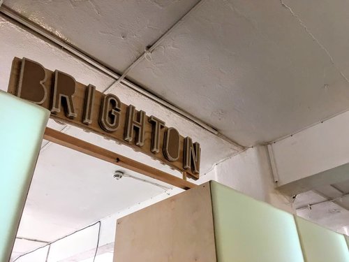
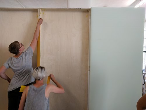
Brighton at Free Range
A selection of graduates from the Brighton Interior Architecture course [where Stephen has been teaching] are exhibiting at Free Range on 14th, 15th and 16th July. Check it out!


21.08.2017
Extension Within a Walled Garden.
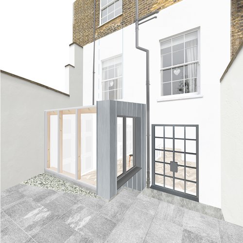
External material study for Stage 4 presentation.
29.06.2017
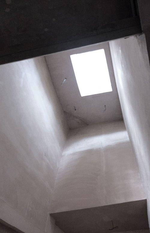
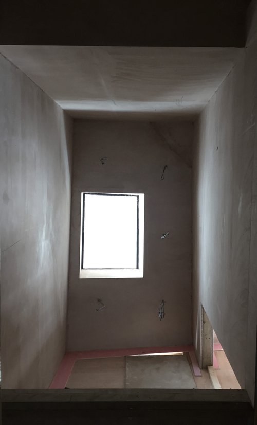
Rooflight & Drying Plaster
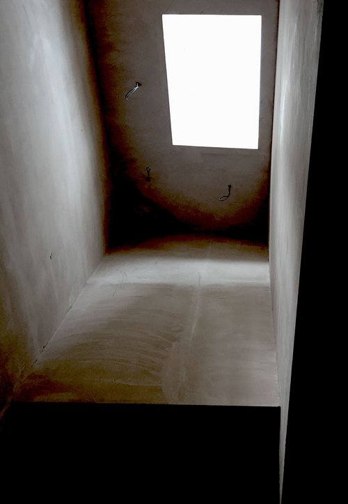
Site visit for A Loft with Arches - enjoying the dappled light on drying plaster in the double height hall.
14.06.2017
Stephen's Year of Teaching in Brighton
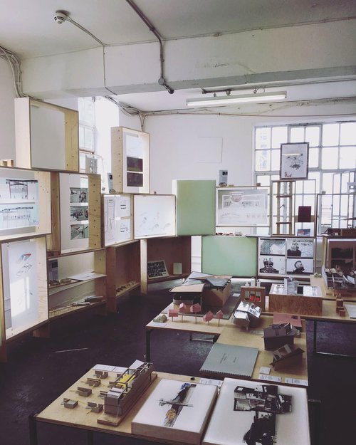
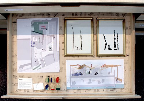
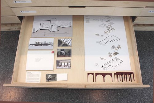
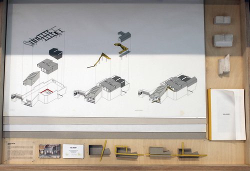
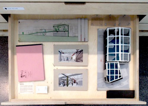
For the past 9 months, Stephen has been teaching a design studio with Gem Barton at the University of Brighton on the Interior Architecture course. Open Sesame was the name of the studio and the brief focused on designing around intangible connections to spaces and places.
The 3rd year students recently exhibited their work at the university graduate show. The exhibition was curated in collaboration with the School of Architecture and comprised 42[!] bespoke A1 plan chests, each made especially for the event. Each chest contained 8 drawers and the graduating students were given 1 drawer to curate and present their work.
Below is a selection of student's drawers.
Julie Tysseire
Katerina Mouyiassi
Elliot Marshall
Ines Koh
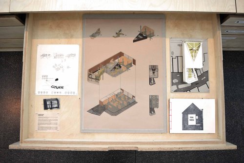
Ben Merry
01.04.2017
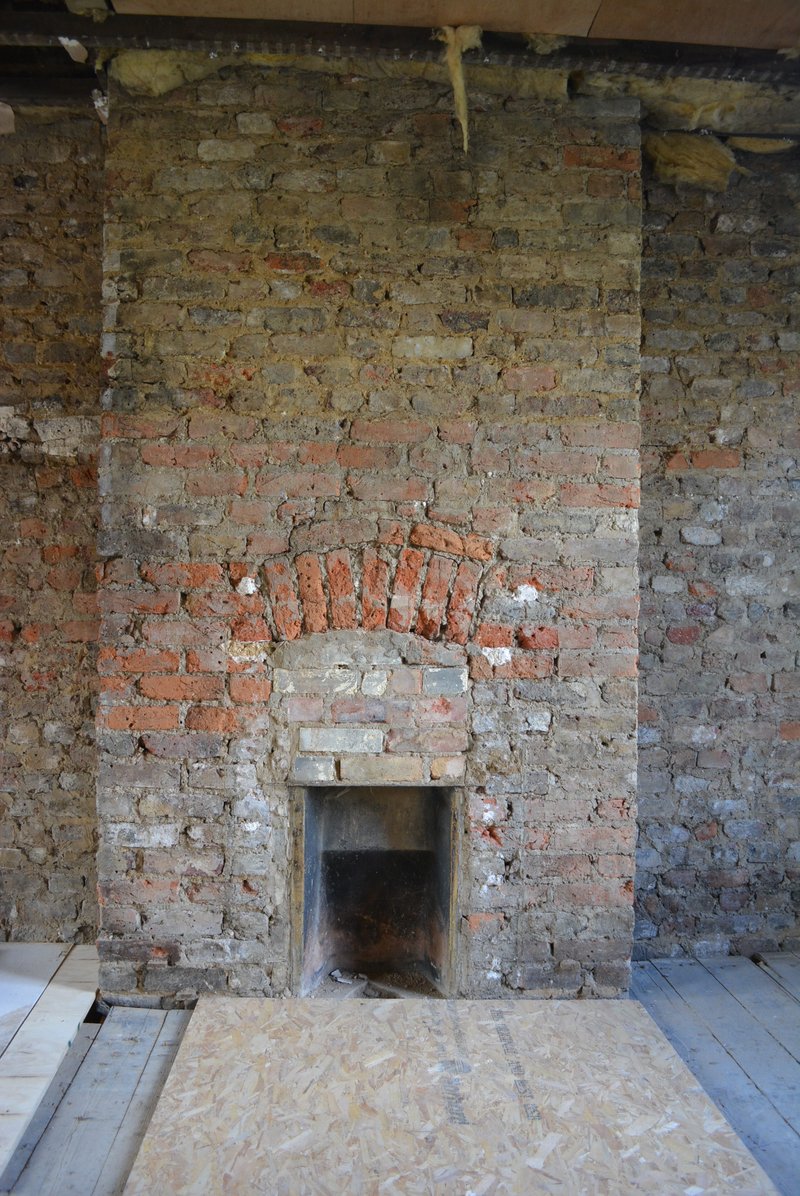
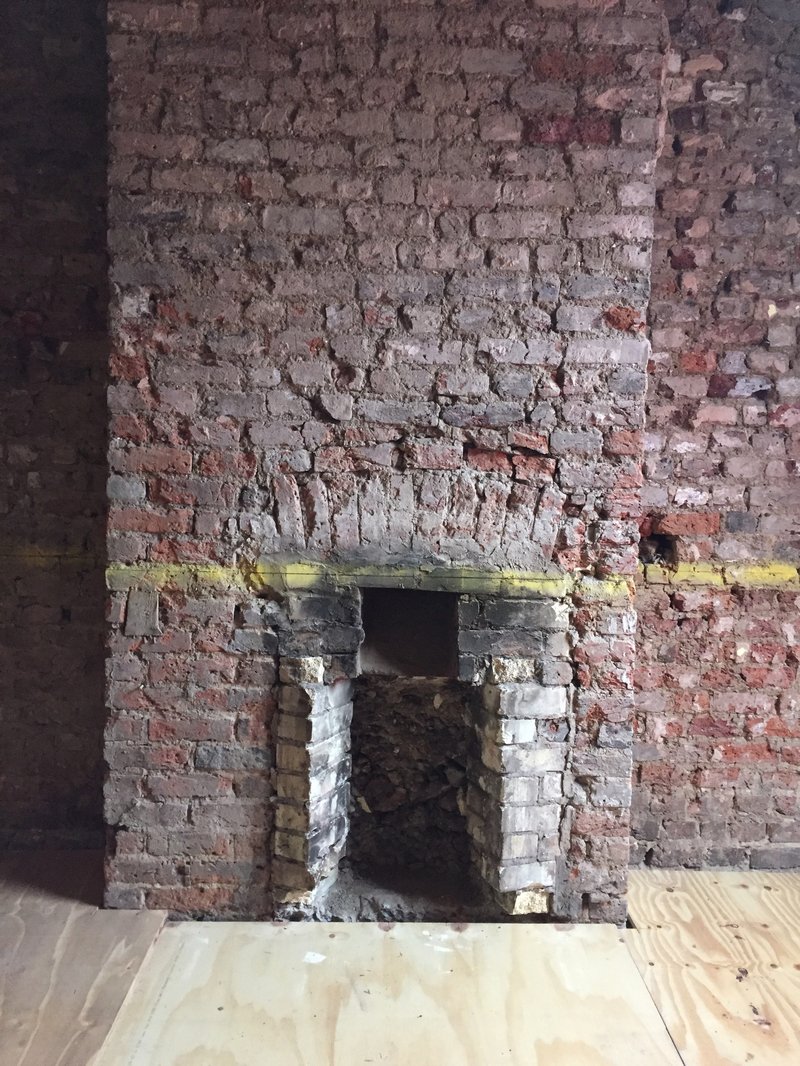
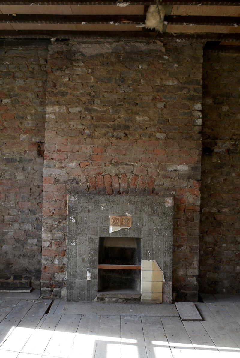
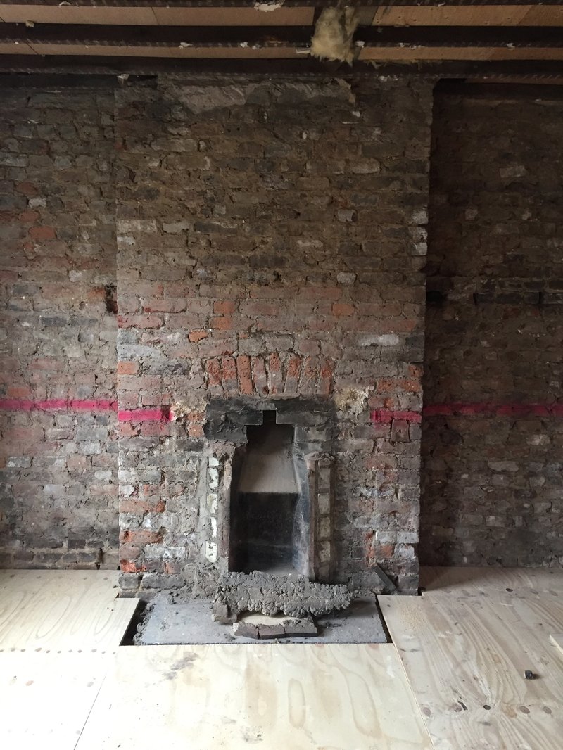
Four Fireplaces From 'A House With A Slide'
Enjoy four fireplaces from one of our projects, which is currently on site. The contrast between the rough brickwork texture, the lapsed composition and the sharp overall edges of the chimney breast is somehow attractive.
31.07.2017
Interior Study for “A House With A Slide”
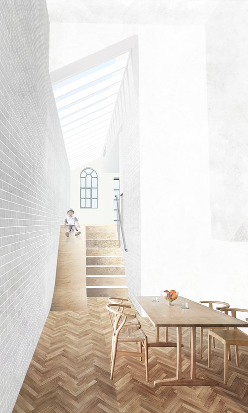
Looking up towards the kitchen window from the double height space at basement level this drawing imagines how the surfaces of brickwork, plywood, parquet and reclaimed floorboards will be brought together and be animated by natural light from above.
This commission by the office celebrates a space we are extremely excited about and is helping the client, ourselves and the contractor to make clearer judgements about its qualities / to better craft its ongoing creation.
Look out for a photographic study of the space under construction coming soon!
04.12.2017
In the Hackney Citizen
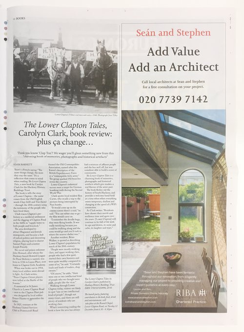
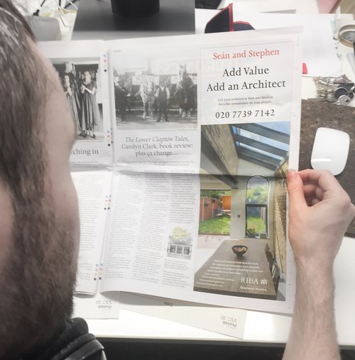
We're proud to be advertising in the excellent Hackney Citizen - the borough's free monthly newspaper. Get your copy!
27.04.2018
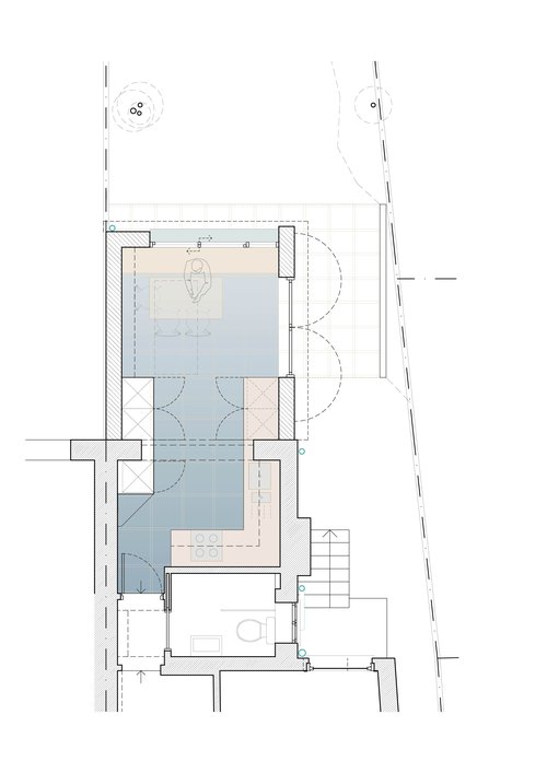
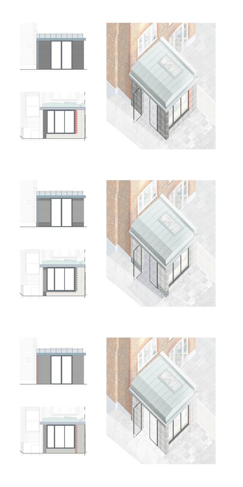
End of Terrace Extension
Plan study of the spatial progression towards the garden and study of external materials.
23.10.2018
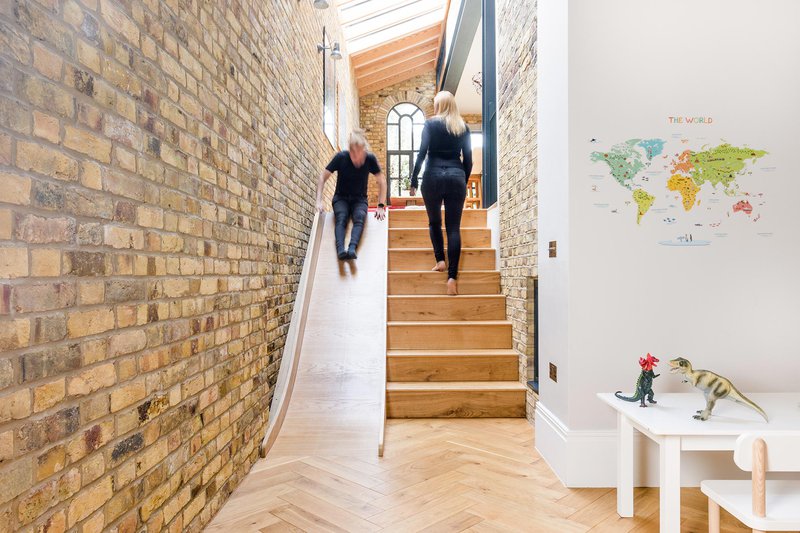
House with a Slide Completion
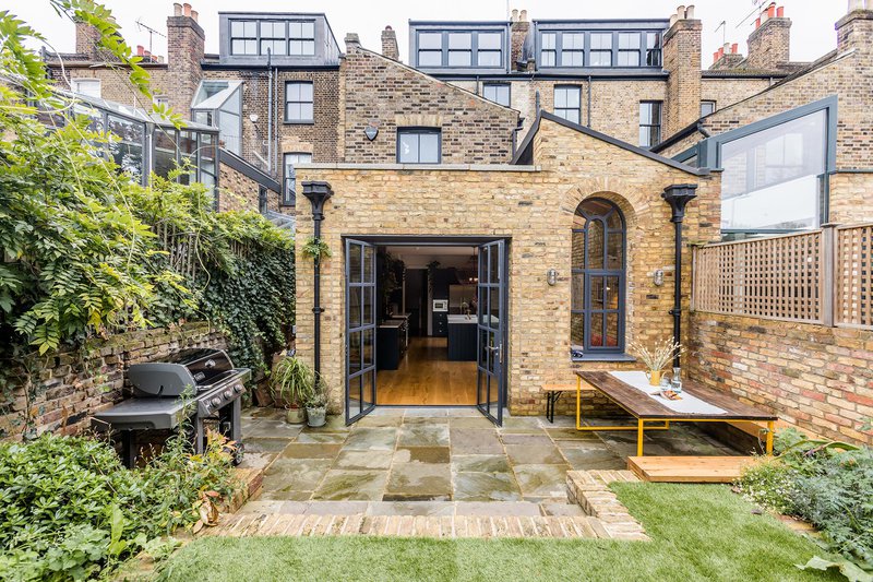
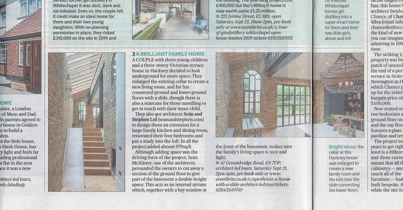
We are over the moon to announce that our wonderful clients have moved in to their House with a Slide. A truly unique family home. A beautiful bespoke house for life.
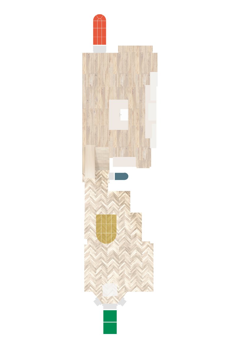
Plan study of the finishes and windows at Ground and Basement level
Sectional through double height space showing slide and brick patchwork
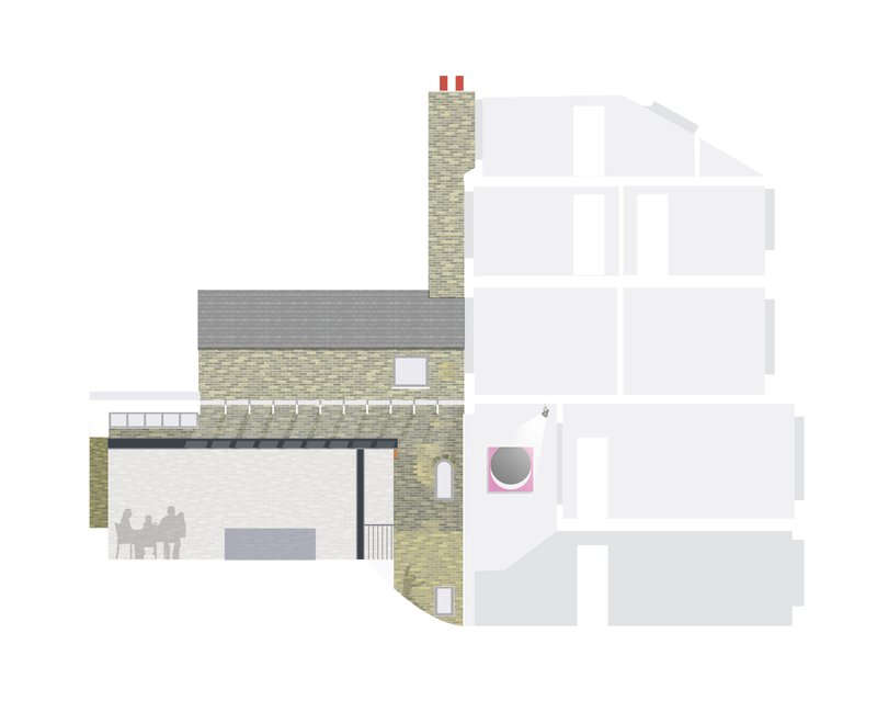
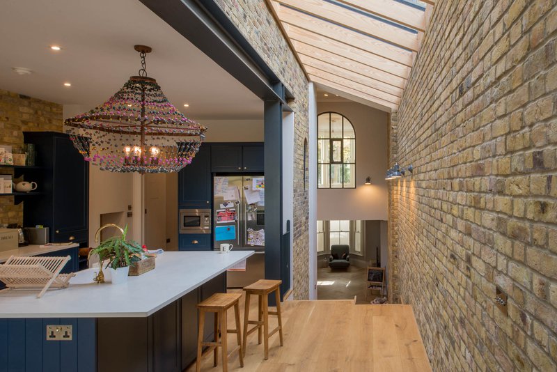
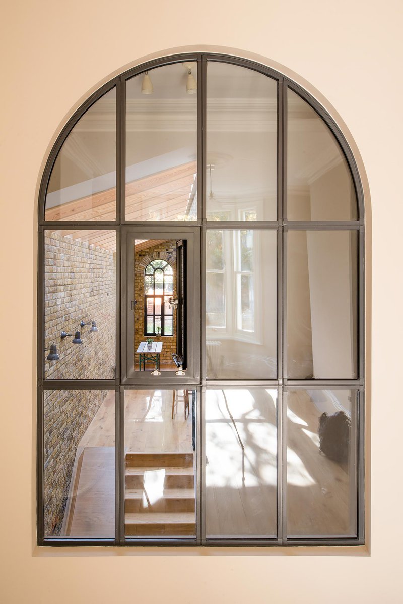
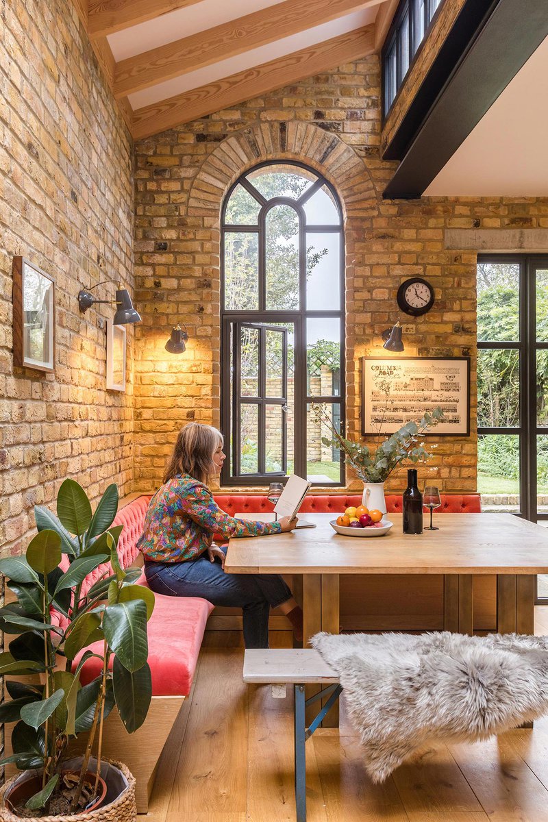
Selected photos below - please see the project page for more :-)
15.01.2018
Considering a House Extension?
We've written this handy article outlining some of the reasons why you might be better off improving your home, over moving home...
01.02.2019
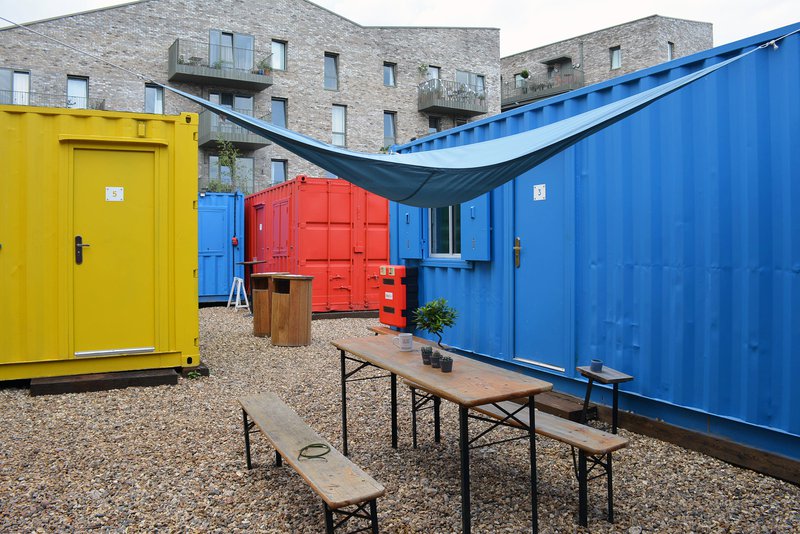
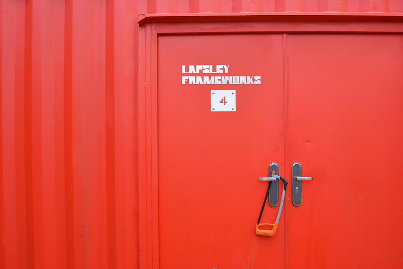
A Collection of Workshops Completion
As part of the Blackhorse workshop in Walthamstow, we inserted a series of containers into the yard to provide a series of studio spaces for artists and makers, bringing the unused yard to life!

01.07.2019
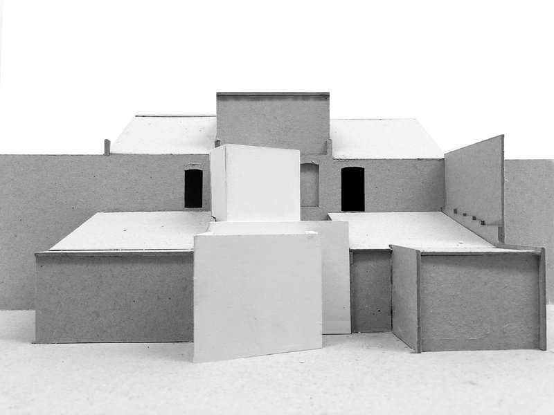
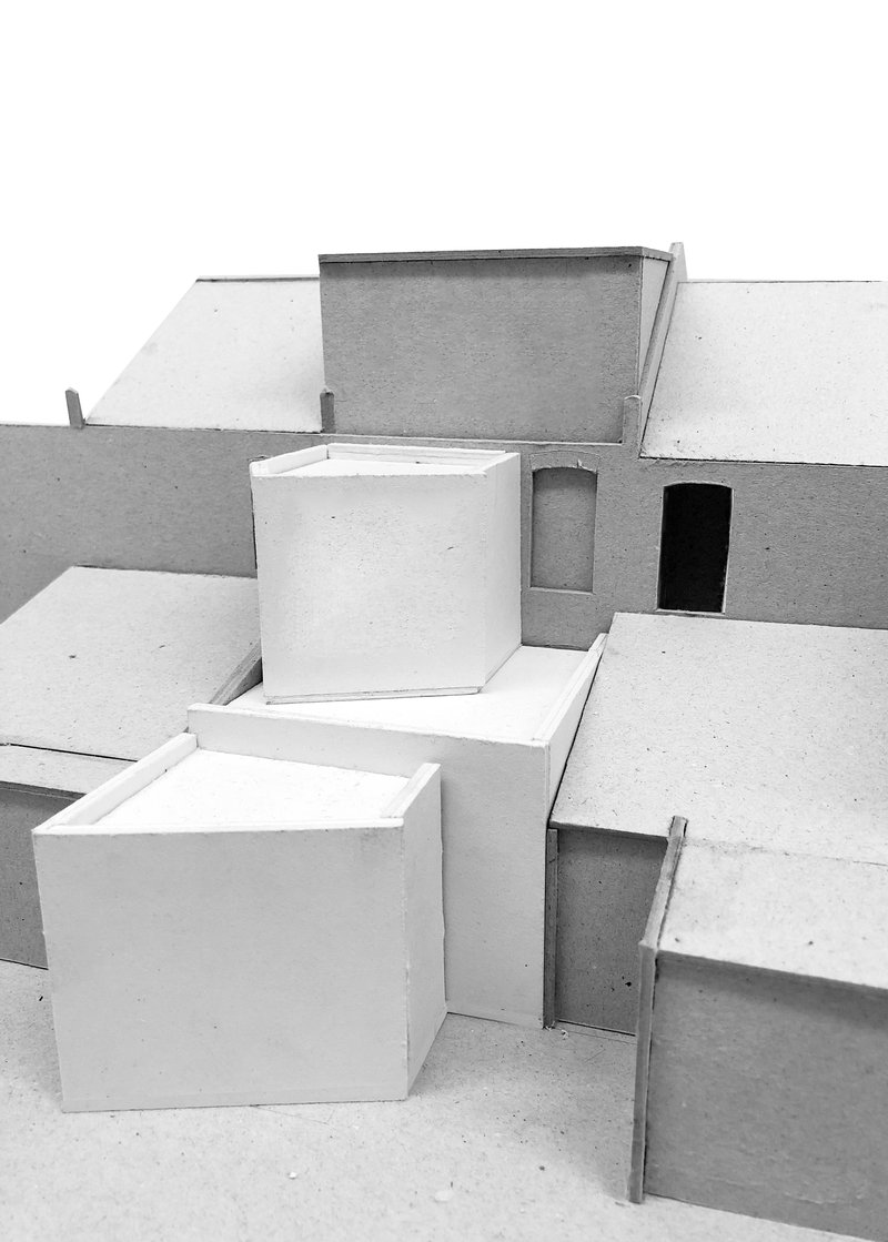
Planning Approval for A Slanted Extension

21.08.2019
House with a slide in the Evening Standard
See our project 'House with a slide' featured in the Evening Standard!
22.08.2019
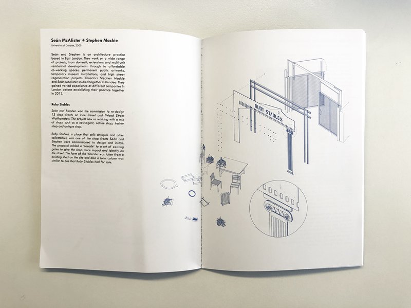
Ruby Stables in DIASPORA exhibition
Our Ruby Stables project is part of an exhibition of drawings by migrants to Scottish Architecture Schools
02.12.2019
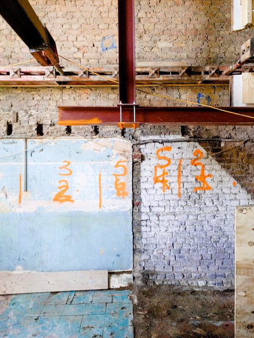
A House with a Concrete Extension
Construction is in full swing on the House with a Concrete Extension in North London.
04.05.2017
We Had A Party
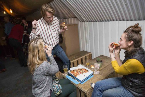
A massive thanks to all that came to our 4th birthday party at Redchurch Brewery. We hope you all had a great night... For those that couldn't make it, here's what you missed...
Photos by Yiannis Katsaris.




10.04.2017
Our New Site Opens
We're very excited to announce that for the last 9 months we've been working with Polimekanos to rework our brand, visual identity and website.
A central and early design move was the hunt for a typeface. Polimekanos found Joanna, a little used typeface these days, designed by the infamous Eric Gill in about 1930. Joanna, named after Gill's daughter, is a slab serif, with angular details on the edges of the upper and lower cases, and very legible in both headings and body text. The highest profile use of Joanna in print we can find is in the Penguin Modern Classics books of the 1960s. We think this typeface holds all the oddities, opportunities and the open-endedness we'd like to bring to our clients and projects. We hope you like the new image as much as we do.
